Stemapunk Month Wallpapers: Manchess, Foster, Tenery, Frietas

We are preparing to send off Steampunk Month on Tor.com. Throughout the month we gave out desktop wallpapers. If you want any, or just want to see some brushstrokes (an in one case sculpture) close up, check out:

HMS Stubbington, the logo
Thom Tenery
Eric Frietas
Jon Foster
Greg Manchess
Quick update: The posters mentioned below are all called-for. But a sincere thanks to everyone for reading.

Steampunk Month Letterpress Poster

We decided that we absolutely had to have letterpress posters for Tor.com's Steampunk Month, so, four of us from Team TorDot drove up to Ross MacDoanld's Connecticut studio and proceeded to have a blast! We went up with a plan and then threw it away, having much more fun re-designing, rewriting, and adjusting on the fly.

For the full story, go to: Making the Tor.com Steampunk press poster.

More photos here.

And if anyone wants one, the first five people that email me their name and address get a poster. UPDATE: Sorry folks - all gone.

And here we are in action:

Donato demo download from Massive Black

Just out from Massive Black's downloadable demo series: Donato Giancola's "The Mechanic." Long term readers know I've seen Donato demo a bunch of times, he's a born teacher. $60 dollars for 5 hours. Download version available now, there will be a DVD version out in November.

Order it here.
Trailer below.
Apropo t0 nothing, I love this painting -- one of my recent faves from Donato.


[Thanks to Dan Dos Santos for the heads up.]

Just in: Idiot's Books still amazing!

The good folks at Idiot's Books continue with what is one of the most interesting works of illustration I've seen come through Tor -- the 81 part serialization of Cory Doctorow's Makers. I'll be sad when it finishes up. Here we are at part 45, and suddenly I really want to wallpaper a part of my room with this.

For more background, see this post.

Vote for Scott Fischer!

My uber-talented friend Scott Fischer has a chance to have his super-cute book Jump placed in a million cereal boxes. Vote for Scott, vote for Jump!

If you don't take my word on it, just try getting through take-two on this video without laughing.

Behind the scenes on the Eye of the World ebook cover

I talk a bit about the beginings of the Wheel of Time ebook cover program and working on The Eye of the World ebook on Tor.com.

"....It seemed a natural to start the series with a portrait of a young Rand beginning an epic journey, the scope of which he could perhaps sense but not truly grasp. David’s luminescent paint lights Rand from within. In a way, it seems to be a portrait of Rand best seen at this time, when readers know so much about what lies ahead of him..."

The full story here.

Eye of the World ebook now on Amazon

Quick update to the post below:

You can now order The Eye of the World ebook on Amazon.

I little behind-the-scenes post on the cover tomorrow.

David Grove, Hall of Fame: a Greg Manchess introduction

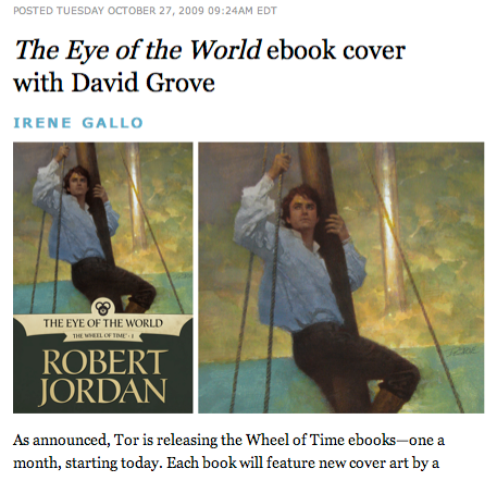
Tor will be releasing The Eye of the World, the first Wheel of Time ebook, tomorrow. As announced, each of the Wheel of Time ebooks will have a different artist on them: First up is David Grove on The Eye of the World ebook.

For some background on David, below is Greg Manchess' introduction at David's induction into the Illustrators' Hall of Fame, June 2007.

--------------

One could describe my friend David Grove as a reluctant illustrator....but a focused one.

You’d never know it from looking at the work of course. There’s nothing reluctant about any of it...the passages of color, sweeping strokes and soft sharp edges blending in and out with such
control....no one goes into this kind of focus with reservation.

I’ve always gotten the sense that David was a bit of a maverick. Born to parents who were both artists, David decided that he would be a chemical engineer. He won a scholarship to Syracuse from a drawing competition.

But after being there awhile he changed his major to photography. He liked the technical side of things. After college he made enough money in a photography studio to indulge his wanderlust and fled to Europe.

Living in Paris, he lived the cafe lifestyle over there and made some money playing jazz piano. After a time, money running low, he was hired to do some pencil drawings for a Macy’s-style shop in France. He lived on the money he made from that one job for 3 months. Living an
exotic European lifestyle.

He was later convinced to come to England to work at a studio, Artists Partners. This only lasted for a year....he might have remained in England but for the toxic nature of English food. He just could not take one more fish and chips. After all, he was getting older, he was 29....that stuff can kill a man.

He came back to the US and after seeing more of the great works of all the great illustrators living in Westport....he promptly fled to California. Where he found a bit of the Parisian cafe life in San Francisco.

At this point, David was doing all sorts of work for advertisers and publishers. I remember one distinct cover of a book he did about some rebels. The title escapes me but the image is vivid. Four figures in a mean-spirited pose, weapons in hand, one figure was a nun. The nun has nothing to do with the story I’m about to tell...but I’ve never forgotten that cover. Maybe he can tell us about the nun later.

David needed guns for this pose and instead of buying them, his technical side had the bright idea to build them. All he needed was the shapes and light on them to draw convincing weapons. But spray painting them in his apt would never do....so, like any sane man, he took them to the roof of the building.

Now, in those days, the SF Police were rather sensitive to rooftop snipers. But David had a deadline....and his focus was on the work. As he was spray painting a few of the fake guns on the roof, he heard the distinct crackle of a police radio, that seemed awfully close. Maybe down in the street. He kept on spray painting. But he soon had an odd sensation of being watched.

He held up the cardboard gun to check out how the sun was glinting off the steel grey cardboard barrel he was spraying, and as he turned to step back for a better look he noticed the door to the roof, and watched, bewildered, as a huge barrel of a gun slid slowly out of a small window by the door and was pointing directly at David.

Moments later he recalls being set upon by rather large members of SWAT, being thrown down and angrily frisked while all sorts of screaming ensued about how he should not try anything like ‘moving.’

With much frenetic silver-tongue reasons, he finally convinced them that the guns weren’t real. One SWAT member went over and picked up the toilet paper roll, cigarette pack, taped weapon and confirmed it.

He was led down to his apt where he showed them what he was doing and while still explaining this in the stairway, as the police were headed out the front door, he happened to notice that his entire block had been cordoned off and a large crowd of people had gathered to watch the SWAT guys shoot the ‘sniper.’

This doesn’t say much about David’s actual painting but more about his focus. He has a tremendous focus and a dead serious laser guided desire to wrangle a piece of painting into the most lovingly crafted flow of beauty.

So much so, that one time David was rubbing away at his painting, in the days when he used acrylics and inks instead of the guache and acrylics he would later use, to get a nice wash of color just perfect for a portrait head that he was doing for TIME magazine......when suddenly he realized he had rubbed completely through the illustration board he was painting on.

This is focus. This is David’s focus.

When I look at his work, I hear it as well as feel it. His washes and color become lyrical in a musical sense. His work is Beethoven strong....Mozart playful....and Paganini driven. And the light....oh....it is scrumptous, edible...it’s not the way the light falls on an object that he paints, but the light the painting generates within itself. It’s as if you could look at a Grove in the
dark and still see it by it’s own light. (I have a Grove at home...I often use it as a nightlight)

I first met him when I was a student. We got along immediately. I loved his passion about illustrating and getting it right. He was the first real professional illustrator I’d ever met. And when I & a friend brought our portfolios over to his apt one day, I realized that this was the lifestyle I wanted to have as an illustrator myself. He was an American Illustrator with a European lifestyle.

He said goodbye to us that day, wished us luck and said, “just remember...when you get out of
school and into the field, I’ll be your competition.”

Again, David's focus.

It is my great honor to introduce my old friend and colleague for the Society’s highest honor, the Hall of Fame....

TOP PHOTO:
Murray Tinkleman, David Grove, Gary Kelley, Linda Kelley, Terry Brown.
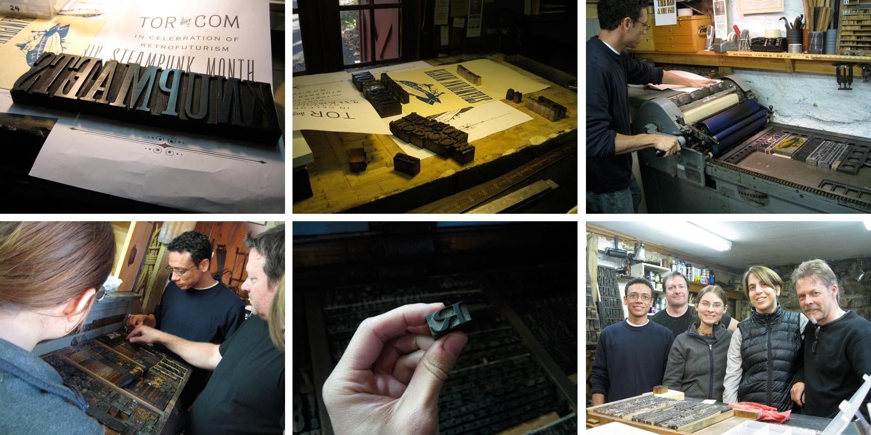
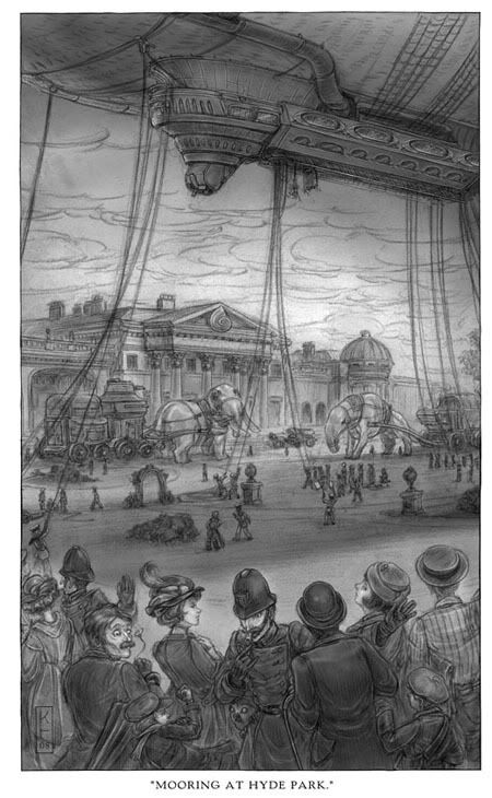
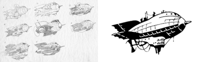
Tor.com Steampunk Meet-up

MORE SHOTS HERE.

We hosted the third Tor.com meet-up last night. In celebration of Steampunk Month we went to Brooklyn's soon-to-open steampunk bar, The Way Station, and encouraged the courageous to polish off their goggles and dress-up for the occasion. Despite heavy rains we had a great, creative crowd that included a number of Tor.com readers, authors, bloggers, artists, and comic book creators.

Animation


Last week on Saturday Morning Cartoons:

The Cat Piano: A beat-noir-feline-Poe-ish horror story. Beautifully drawn. Narrated by Nick Cave—it’s as great to listen to as it is to watch. (8.30 minutes.)

The Lighthouse Keeper: Sometimes bugs are the good guys. A Goeblins film. Which means, of course, it’s beautifully designed and animated. (3.15 minutes)

Google Maps Alphabet

Creative Director Rhett Dashwood made an alphabet out of Google Map images. Very cool.

[via Scott Brundage]

The High Life

Grottaglie, Italy

Another installation from this year's Fame Festival. This was placed near the local fly-tipping area and dog pound - the high life indeed! This has just been released as a print on metallic paper, signed and numbered. Find out more here.
The image is also available in a very limited, very large format through Andipa Gallery.

Free Eco Organic Label Icons Vector Pack

A set of 11 organic vector symbols from Marielle P.K. . You can use them for eco-friendly product box design, logo - brainstorming or decorating a design composition of yours.

The artwork is saved in EPS file format, you can use any vector compatible editor to modify or customize it. Licensed under a Creative Commons Attribution-Share Alike 3.0 License. Download

To use, decompress the *.rar file with WinRar or StuffIt (Mac Os)

Kinuko Craft

In today's email. Not a bad way to start the day.

And if you are near Hartford, CT, you should check out the Joseloff GAllery exhibit, Enchantment to see Kinuko's work among many others, including N.C. Weyth, Walton Ford, Odd Nerdrum, Bouguereau...

Animation: "This Way Up" and "The Falcom"


Again, falling behind on the animation notices here but I love "This Way Up" to much not to give it a shout-out here. It's hilarious and surprisingly sweet.

Tor.com Saturday Morning Cartoons

This Way Up: This one's a charmer if you're up for some gallows humor that's somehow very endearing. I watched it three times in a row and laughed each time. (8.48 minutes)

The Falcon: A menagerie in camera parts. A techno soundtracked mood piece. (2.50 minutes.)

There's one in all of us.

Count me in among the millions that wanted Spike Jonze's head on a platter if Where the Wild Things Are wasn't fantastic. I went in assuming I'd either leave the theater bitter and disappointed or ecstatic and giddy and raving about how great it was. Instead I came out wanting to kick and throw things, run, climb trees, and fall down exhausted. It made me quiet and moody and inarticulate. In other words, it is fantastic, and in way I never expected.

Vance Kovacs and Michael Morcock's Hawkmoon

Meanwhile, somewhere on the left coast, Vance Kovacs continues to work on Hawkmoon series. Mad Gods just wrapped up -- now to jump onto book 3.

Lightspeed Magazine

Another venue for artists. Prime books is launching Lightspeed, an online sf fiction magazine that promises to buy artwork. Not sure what their pay rates will be but it's worth keeping an eye out. They say submission guidelines are due out at the end of the year.

Lightspeed holding page here.
More info at SF Scope here.

(As an aside, among our various attempts to name Tor.com something else, Lightspeed was our longest contender....We even have mastehead sketches.)

Vote for Scott Fischer's JUMP!

People here know Scott Fischer for his amazing sf/f book covers and gaming art. But Scott wears many hats and he's also a children's book writer and hyper-cute performer. His new book, Jump, is up for General Mills "Spoonfuls of Stories" program. That could mean Jump in Cheerios boxes! Go! VOTE FOR SCOTT HERE!

Illustration Master Class 2010, open for enrollment

Illustration Master Class is now open for enrollment. Seven days of class time, lectures, figure drawing, critiques, and portfolio reviews. These are intense days. Starting at 10:00am, ending well past midnight. This is, without a doubt, my favorite event of the year. (To see why, you can check out these past Master Class posts.)

A word of warning: the past two years sold out.

Illustration Master Class
June 12-18, 2010
Amherst, MA
$1,950.00 - includes studio class, lectures, room and board.

Faculty:
Julei Bell
Dan Dos Santos
Scott Fischer
Irene Gallo
Donato Giancola
Rebecca Guay
James Gurney
Greg Manchess
Boris Vallejo

Jon Foster, new site

And speaking of new sites, Jon Foster has updated and redesigned his site. It's great to see his newer work collected. And even better, a chance to drool over his sketches. The guy does amazing sketches.

Sam Weber, new site and Lord of the Flies


Same Weber relaunched his website. Which would be great news all on it's own, but, even better, he's included his work on Lord of the Flies.

The art of Levathan, part two: An interview with Keith Thompson

We just posted the second half of our “Art of Leviathan” intreviews on Tor.com. Earlier we talked with Scott Westerfeld about what is was like to be the art director on his own book—the steampunk, young adult novel, Leviathan. Now we have artist Keith Thompson talking about the fifty illustrations that help flush out Scott’s world. Keith did a great job of mixing historical details with fantastical creatures (both mechanical and animal) creating a fun, action packed pace while maintaining the tone of a more formal era.

See the full interview on Tor.com.

What kind of research did you do for the book, either for artistic inspiration or for historical details?

It’s a bit dangerous for me when the setup is as interesting as WWI. I actually had to pull back a bit as my research was taking away time from the art at points and it was making me far too pedantic about my details. That might have been fine for a drier and harder type of alternate past story, but I knew that Leviathan was meant to be a rip-roaring type of adventure and that a fun and fantastical angle to the art was extremely important.

I also wanted to have the historical setting somewhat pliable, as it would be a very bad thing to plunk all these walkers and beasts and things in the middle of history without having ripples spread throughout the setting; changing little things from how a nation’s cavalry uniform looks to how a culture’s architecture has evolved.

I’m learning new interesting things all the time and compiling them into a pretty elaborate collection of research. I’ll be researching right up to the last illustration, and will probably have collected a monumental load of brilliant things I’ll wish I could have incorporated but couldn’t fit in.

The art of Leviathan, part 1: An interview with Scott Westerfeld

Leviathan, Scott Westerfeld’s highly anticipated and extensively illustrated young adult steampunk novel, releases today. Whenever I’d run into Scott over the past year or so he’d whip out his iPhone and excitedly show-off the latest drawings by Keith Thompson. After a few of these incidents it became clear that Keith wasn’t just adding a few embellishments to the book but, with fifty drawings throughout, was helping to create the world of Leviathan.

I took the opportunity to interview Scott and Keith about the project. Part 1 is the interview with Scott talking about his dual role as author/art director.

Check out the full interview on tor.com
Did working on the illustrations for Leviathan affect your writing for book two?
Because we have an illustration almost every chapter, I simply can’t have my characters sitting around and talking for very long—stuff has to happen. This is great for recreating the action-packed feel of the “boy’s own adventures” that I was inspired by, but I’ve learned a few subtler tricks to create visual interest. Sometimes, a really cool-looking thing can just show up, and thanks to Keith’s brilliance, that’s enough to fill the page. Also some very quiet illustrations—a pocket cameo, a pair of teacups—have turned out to be wonderful storytelling aids.

And, yes, certainly when a drawing of a machine or beastie comes out great, it will tend to stay in the story more. Some throwaway ideas have become pivotal parts of the plot, just because Keith made them look so damn cool.

Stay tuned for part two, talking with Keith Thompson, this Thursday.

It's Steampunk month on Tor.com. And, see the process of Greg Manchess' Tor.com steampunk logo

October is Steampunk month on Tor.com. Huzzah. We've started with a number of cool posts already, you can follow the fun here.

And you can see Greg Manchess' step-by-step progression of our Tor.com rocket, Stubby, into the lighter-than-air goodness of the H.M.S. Stubbington.

Blog Archive