 | |||||
| Yinka Shonibare, 'Stop Cutting' |
View image full size for print and download
Download the press release

Nothing could have been more impractical than becoming a professional illustrator. My style--such as it was-- had no precedents and therefore no clear outlets.Blechman showed one of his school assignments, a hand sewn booklet ("got a B-") to the editor at Henry Holt, who asked if Blechman could make a similar book on a holiday theme. Blechman chose the medieval theme of The Juggler of Our Lady.
I set to work immediately. Clearing the kitchen table of everything but the white paper and Will Durant's Age of Faith as reference, I started the book that evening and finished it the same night. In the morning I took it to Holt, and it was accepted for publication. An epic event in my life.His feeble, neurotic line, combined with a brilliant concept, caught on hmmediately and Blechman was launched on a long and profitable career doing books, cards, advertisements and television commercials in his distinctive style.


When the Juggler of Our lady was published and met with great acclaim, I associated success with the book not with me, whom I considered undeserving. Convinced that success lay in producing other Jugglers, I set out to do more of them. Son of the Juggler, Grandson of the Juggler, Grand Nieces and Nephews of the Juggler....They were stillborn, all. In the meantime, the years went by, and, still desperately trying to produce offspring-- Cousin of the Juggler, Bastard of the Juggler-- I would not stop: I could not stop. I did not realize that I was changing from the 22 year old who had sat down at the kitchen table with a pad of paper, The Age of faith, and a vision. No longer the same person I could no longer produce the same work.Once Blechman returned to wracking his brain to put fresh creativity and honest effort into each new concept, his success was assured. The following illustration from later in his career is only about four inches wide:


 | |||||||
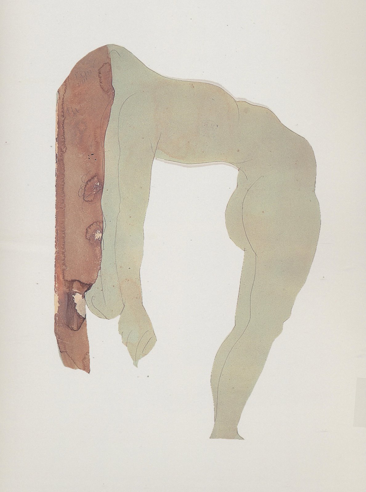
| Mark Wallinger, 'Reckless' |


 Grottaglie, Italy
[neuromarketing is] a new field of marketing which studies consumers' sensorimotor, cognitive, and affective response to marketing stimuli. Researchers use technologies such as functional magnetic resonance imaging (fMRI) to measure changes in activity in parts of the brain, electroencephalography (EEG) to measure activity in specific regional spectra of the brain response, and/or sensors to measure changes in one's physiological state (heart rate, respiratory rate, galvanic skin response) to learn why consumers make the decisions they do, and what part of the brain is telling them to do it.Would a CGI picture evoke a better reaction if the hero's shirt was blue rather than red, or the heroine had longer hair? Would a CGI animated kiss come across as more passionate if it were five seconds longer or shorter?

I can't believe such pointless work is still being appreciated today. Anyone can achieve the same thing in half a second with a camera...Some scolded that to qualify as genuine Art, "The act of interpretation should be in service of something more" than merely "perceiving form" with pencil or charcoal.
My camera is capable of interpretations too, I can set it to add filters and thus alter the actual captured photons. After all, you can call every human drawing an interpretation...


What is all this juice and all this joy?
A strain of the earth's sweet being in the beginning.
...............................-- Gerard Manley Hopkins


"Did you do some illustration for Ricoh?"
I told them I hadn't and they responded "Well I saw this ad in a magazine and it looks just like your character."


