A new Michael Whelan book cover doesn’t come around very often so I am super excited to present his artwork for our upcoming fantasy series,The Way of Kings, by Brandon Sanderson.
If you click over to Tor.com you can see progress shoots and read what Michael had to say about working on the project.
Robert McCall
I am sorry to hear that Robert McCall, 90, has passed away. I don’t think there is a popular artist more intimately connected with NASA and space exploration as McCall. Looking at his work you cannot help but to think that common-place space travel should be both wondrous and possible. He has influenced and inspired millions throughout his lengthy career with his documentary paintings, film concept art (including 2001: A Space Odyssey), postal stamps, and museum murals.
For more in depth reading:
CollectSpace.com
Lines and Colors
“One of the joys of being an artist is the freedom to create one's own world....Like the real world, these excursions of the imagination are fraught with inaccuracies of perception—it is rare that one glimpses through the veil of time even a hint of tomorrow's reality — nor does it seem important to me whether one's perceptions are right or wrong, the pleasure is in making the predictions and doing the work.”— Robert McCallTake some time to visit McCall’s work on his comprehensive website. You’ll be glad you did.
For more in depth reading:
CollectSpace.com
Lines and Colors
Spectrum winners announced!
Run over to the the Spectrum site! There you can see all the award winners, plus get an inside look at the judging process.
I’m sorry I couldn't catch all the names from the video so here I’ll just say and extra congrats to award-winning friends:
Sam Weber X2!
Donato Giancola
Chris Buzelli
Omar Rayyan
Eric Fortune
Eric Orchard
Daniel Docui
Michael Deas
Ed Binkley
Craig Elliot
Scott Gustafson
And a congrats to all the artists that participated.
The Keep
The Brief: A Bad Dragon
The Critique: What's he going to do to that castle? I think he's going to eat the princess. Is he mean? I think he should be mean. I think the princess is stuck in there for her whole life and then the dragon family came and went swimming in the lake and got eaten by crocodiles.
Job Status: Approved
Artist's Note: I have books! All the pre-orders ordered from me are in the mail - more info here: http://www.facebook.com/TinyArtDirector
I'll Crumble 4 Ya!
"Regal Garden" pattern texturized.
It's been almost three years since my texture book was published. But I've continued to grow my own personal archive of cool textures none the less.
The other day I was getting ready to put on an old "Bad Design Kills" t-shirt and noticed the white ink on the skull had started crumbling creating a very cool texture.
"Heavy Crackling" texture.
I call these moments of "Creative Curiousity" and when they arise I try not to ignore them but rather act upon them.
So I took the shirt and scanned it in and created an authentic looking visual resource you can use on any type of illustrative or design project. So enjoy this freebie texture provided by the second law of thermal dynamics.
Source File Specifications.
The "Heavy Crackling" texture download Includes the following:
- Layered Grayscale PSD File (Hi-Res, 12x10 inches @ 800 dpi)
- Bitmap Dithered Tiff Image (Hi-Res, 12x10 inches @ 300 dpi)
Download "Heavy Crackling" Texture. (File Size: 76.6MB)
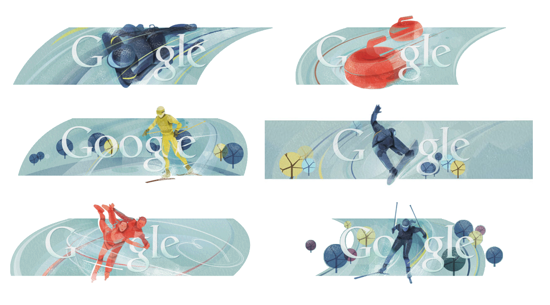
Google’s Olympic 2010 logos?
Speaking of no credit...Who did these?
I luvs them.
Almost as much as I luvs Apollo and the Flying Tomato.
I luvs them.
Almost as much as I luvs Apollo and the Flying Tomato.
Who’s awesome? Or, Credit the Artists!
Lou Anders started to make some noise, via Twitter, against authors and publishers who put up “Look at my cover! Isn’t it the awesome!?” posts without crediting, you know, the artist.
I have to admit, I shook off the issue as a typical oversight. I remember being upset that Amazon, and other online retailers, didn’t credit the artists — information easily obtained while browsing a a physical store — and there was nothing to be done about that....I guess, I came to expect it from others as well.
But, with Lou’s rallying call in the back of my mind, last week’s Scholastic post on their Mockingjay cover has pushed me into the gently irate crowd. Scholastic posted an article excitedly revealing the cover to a popular series, along with the a refresher on how great the full series looks, without a single mention of the artist or designer. This is from the publisher, not from an author who might be far enough removed from the process not to know better. Just to reiterate, the post is about the cover.
Which is not to pick on Scholastic, it happens all the time. So, dear authors & publishers, when pimping a cover, name names!
Art Departments are constantly being told how important it is to get the cover right. Credit those whose talent, creativity, and hard work get the job done. Turn it into a marketing point. Like writers, artists' careers are built on past success. The more attention paid to good work, the more jobs they get...advancing their worth to me as an art director. Whelan, Donato, Martiniere, these guys are valuable first and foremost because they are good at what they do...but they are also “names” in the field and that furthers our marketing efforts.
Besides, it’s the polite thing to do.
Oh, and: Hey, Tim O’Brien, great series of covers!
Tim’s website, blog, “making of” the first Hunger Games cover
Boskone
A quick shout-out to all the people that make Boskone one of the most pleasant conventions of the year. Thank you, NESFA! It’s always a smoothly run, just-the-right-size convention with a kickin’ art show.
Fuzzy iPhone or “borrowed” photos here.
Great to see John Picacio, Artist Guest of Honor. John is a unique voice in the field and dedicated to the vitality of the genre as a whole. [top image]
Michael Whelan had a 40 painting exhibit. An amazing retrospective that started with his college work and chronological built up to brand new paintings.
Omar Rayyan had a knock out out show. Man, that guy just keeps getting better.
Bob Eggleton and Marianne Plumridge where a delight to share dinner with...And made me think, why not have a Boskone panel meet at one of the nearby art museums?
The now-traditional Rick Berry Studio visit was, as tradition will have it, a mellow blast.
These photos, taken by John Picacio, made me laugh because it reminds that I didn’t leave that seat very much throughout the day...Or weekend, for that matter. Charlie Stross on the left and Michael Whelan on the right.
After the con I was able to convince now-Boston artist Scott Bakal to come out and play while the dead-dog party deaded around us.
....and it’s possible this Rick Berry painting followed me home.
Tyler Jacobson wins the Jack Gaughan Award
Hurray to Tyler Jacobson! He won the New England Science Fiction Society’s Jack Gaughan Award for Best Emerging Artist given out each year at Boskone.
I was honored to be on the jury with Todd Lockwood and Bob Eggleton. I first met Tyler last May during the Academy of the Arts University student exhibit and was immediately struck by his bold brushwork. (In fact, I believe I emailed Jon Schindehette that night from my hotel room, “Dude, you gotta check this guy out.”) Todd, Bob, and I looked over a number of really great portfolios—so much good talent coming up—but in the end thought that Tyler was an exemplary representation of the award — newly in the field but with work beyond-his-years, a deep portfolio of consistent work, and a motivated professional who has already established himself with clients.
Congrats, Tyler!
Check out his website and blog.
(And be sure to look at the sketches section..love those bold black and whites.)
"Jack Tar" This new wall lamp features really, Really old barn wood in a totally unfinished manner. The glowing alabaster dome is set off by antique brass details. 12" x 12" x 6" deep. Designed, hand made, signed and dated by Art Donovan
Our new "Down's Path" wall torchiere boasts pure rectilinear geometry. Three rectangular lamp shades in stark white spun filament glow from the left, center and right of the solid mahogany lamp body. Entirely hand made and uses a single bulb for efficiency. 29" tall x 9" wide x 4.25" deep. Designed, hand made, signed and dated by Art Donovan.
The Spire 2 Wall Lamp is an updated version of our popular Spire series. Here, the post ( instead of satin nickel) is hand shaped poplar shown in a muted white with a brass finish piece at the top. Topped with ourhand made, proprietary "Moire" polycarbonate lampshade. Bronze taping and antique brass hand stitching completes the design. The height is 34" and the lampshade is 12" wide x 6" deep. Designed, signed and dated by Art Donovan.
After being immersed in the art and design of "Steampunk" for the past three years, it was inevitable that the styling would show up in my lighting design. Pictured here is the Oxford Station Wall Lamp. This is a Severely Limited Edition in hand blown glass and solid brass. The Top and Center images are acid-washed oak and the bottom version is rich, satin mahogany. Signed and dated. Click here to see the Official Blog of our Steampunk Art Exhibition at the Museum of the History of Science, the University of Oxford, UK.
Heart Worm™
Heart Worm™ Character Design.
Armin Vit is like the Mark Twain of the design industry. He's talented, creative, and witty. So when he asked me to be part of the re-branding of Valentine's Day for NPR Studio 360 I was happy to contribute to the effort.
(cue mission impossible theme music)
My specific task was to re-create a character to replace the standard "Cupid." This whole effort is tongue in cheek so immediately an idea formed in my mind and that was "Heart Worm™."
I Heart VDAY!
I decided to give a graphic nod to one of our industries most iconic designs with this usage of the Heart Worm™.
Twitter name application.
The Heart Worm™ can easily be adapted to work in any social media environment.
Heart Worm™ LOVE.
A classic and timeless application of the Heart Worm™ demonstrating it's versatility.
So on Valentine’s Day let your heart be infested with the Heart Worm™. Its burrowing presence will give you passionate heart burn for the apple of your eye. Eat your heart out Cupid! Plus, it can flex into a number of helpful shapes as you can see above.
Read more about this whole project at Brand New.
Download Heart Worm™
Download the Heart Worm™ Brand Sheet
Heart Worm™ T-Shirt
- Infest Your Chest with our Unique Heart Worm™ Tee.
http://www.zazzle.com/heart_worm_tshirt-235510814215009727
Lone Lion
The Brief: A Lion
The Critique (on the inked version, above, after some fussing with details by the artist): You showed me that a million times! I think it's awesome, but I don't want to see it again. I don't like all of that ink. So take all that black away except the black of the out-lions... Hey - out-lions of the lion!
Additional Comments: You're not supposed to color in with black. That's what my teacher says. You're doing art the wrong way. Hey, talking about ink can I try using ink? Please please please?
The Critique (on the colored version, above): Whoa! That, my friend, is awesome! ... I've been wondering: why does this side have 3 whiskers and this side have 2 whiskers?
Job Status: Approved
Artist Notes: Thanks to everyone who weighed in on the facebook page about the different versions of this! If you haven't checked out the facebook page or the twitter feed yet, you should - there is stuff there including upcoming contests that won't be here!
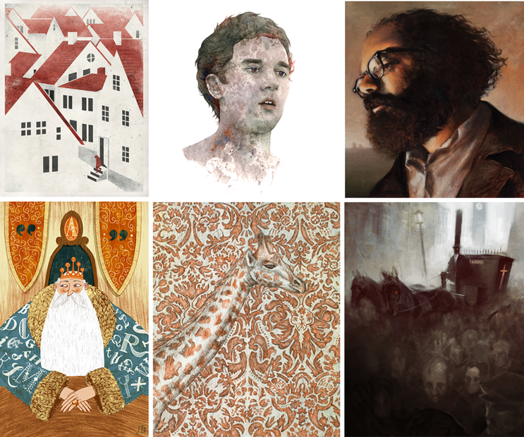
The Society of Illustrators student sholarship ehxibit posted.
The Society of Illustrators has posted all of the artworks juried into the student scholarship exhibit.
Congrats to all the students! I look forward to seeing these drawings and paintings, and meeting some of the students, at the opening in May.
TOP ROW: Ligia Teodosiu, Grant Hanna, Leon Doucette
BOTTOM ROW: Jim Tierney, Stephanie Georgopoulos, Mike Puncekar
Congrats to all the students! I look forward to seeing these drawings and paintings, and meeting some of the students, at the opening in May.
TOP ROW: Ligia Teodosiu, Grant Hanna, Leon Doucette
BOTTOM ROW: Jim Tierney, Stephanie Georgopoulos, Mike Puncekar
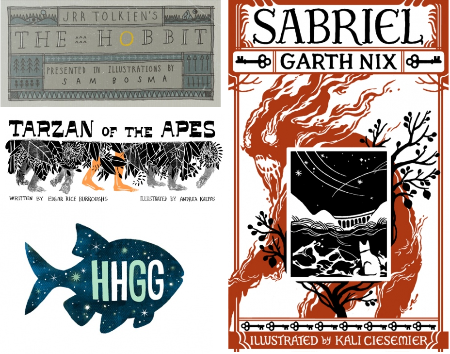
Picture Book Report
Meg Hunt and colleagues have started a literary illustration blog, Picture Book Report — fifteen artists will be create illustrations inspired by a favorite book. Many, in fact, most, of the titles are science fiction/fantasy, including A Wrinkle in Time, Hitchhikers Guide, Robin Hood, The Hobbit, Tarzan, Peter Pan, among others.
From the mission statement:
There is a certain kind of magic to books and stories that is hard to beat .... At the same time, there’s this stigma against books with pictures, that they’re something you leave behind after you get to a certain age. The urge to make our own mark upon this format is immense. To give back to that tradition of storytelling and share our own along the way.”
They began last week with a great series of bookplates to set the stage. I’m looking forward to checking in often and seeing fresh interpretations on so many classic titles.
(In addition to all the great talent involved, I love anything vaguely Robin Hood or Tarzan-y — color me psyched.)
A Lion of Lions
The Brief: A Line of Lions...It's the same word! Line and Lion! Hey, how about you draw one of their prey, like a dead antelope that they want to eat?
The Attempted Assistance: Hey, want me to do the horns for you? And they bit her, so I'm going to make a little hole of blood. Can I do that at the end?
The Critique (of completed work): Coool - but you didn't do the little blood spot... What about lion cubs? I want you to do it with the lion cubs. And the mother right next to them. Why did you do it all boys? I wanted you to do some mothers.
Job Status: Approved
Dan Dos Santos and the Wheel of Time ebook cover: The Fires of Heaven
Presenting!...The next of our Wheel of Time ebook covers: The Fires of Heaven with art by Dan Dos Santos.
Dan had the unenviable task of having to paint a preternaturally beautiful and ageless woman. He did a wonderful job of it, I’d say.
Head over to the Tor.com post to see his sketches, progress shots of the painting, and our initial thought process.
RELATED:
All Wheel of Time ebook posts are archived here.
Which include:
David Grove on The Eye of the World
Kekai Kotaki on The Great Hunt
Donato Giancola on The Dragon Reborn
Sam Weber on The Shadow Rising
Two excellent articles on the vaule of work.
As Milton Glaser reminds us, art is work. Here are two excellent articles on the value of work. One funny, the other less so, both important.
(Written by and about writers but applies to artists of all kinds)
Charlie Stross: Information, Freedom, Flame-bait
John Scalzi: Why Publishing Will Not Go Away Anytime Soon: A Deeply Slanted Play in Three Acts
(Written by and about writers but applies to artists of all kinds)
Charlie Stross: Information, Freedom, Flame-bait
John Scalzi: Why Publishing Will Not Go Away Anytime Soon: A Deeply Slanted Play in Three Acts
ZOMG, Dino app!
From the American Museum of Natural History, which I love. But where is my Carl Akeley Hall of African Mamals app!
Greg Manchess and The Irish Country...
Designer Jamie Stafford-hill had reason to email me the full gamut (so far) of our “Irish Country” It made me go “ahhhh....” The day needed a calming influence.
Layout by Jamie, art by Greg Manchess.
Subscribe to:
Posts (Atom)
Blog Archive
-
▼
2010
(165)
-
▼
February
(19)
- Micahel Whelan’s cover for Brandon Sander’s The Wa...
- Robert McCall
- Spectrum winners announced!
- The Keep
- I'll Crumble 4 Ya!
- Google’s Olympic 2010 logos?
- Who’s awesome? Or, Credit the Artists!
- Boskone
- Tyler Jacobson wins the Jack Gaughan Award
- "Jack Tar" This new wall lamp features really, Re...
- Heart Worm™
- Lone Lion
- The Society of Illustrators student sholarship ehx...
- Picture Book Report
- A Lion of Lions
- Dan Dos Santos and the Wheel of Time ebook cover: ...
- Two excellent articles on the vaule of work.
- ZOMG, Dino app!
- Greg Manchess and The Irish Country...
-
▼
February
(19)