Showing posts with label Jamie Stafford-Hill. Show all posts

Facelifts: Virga


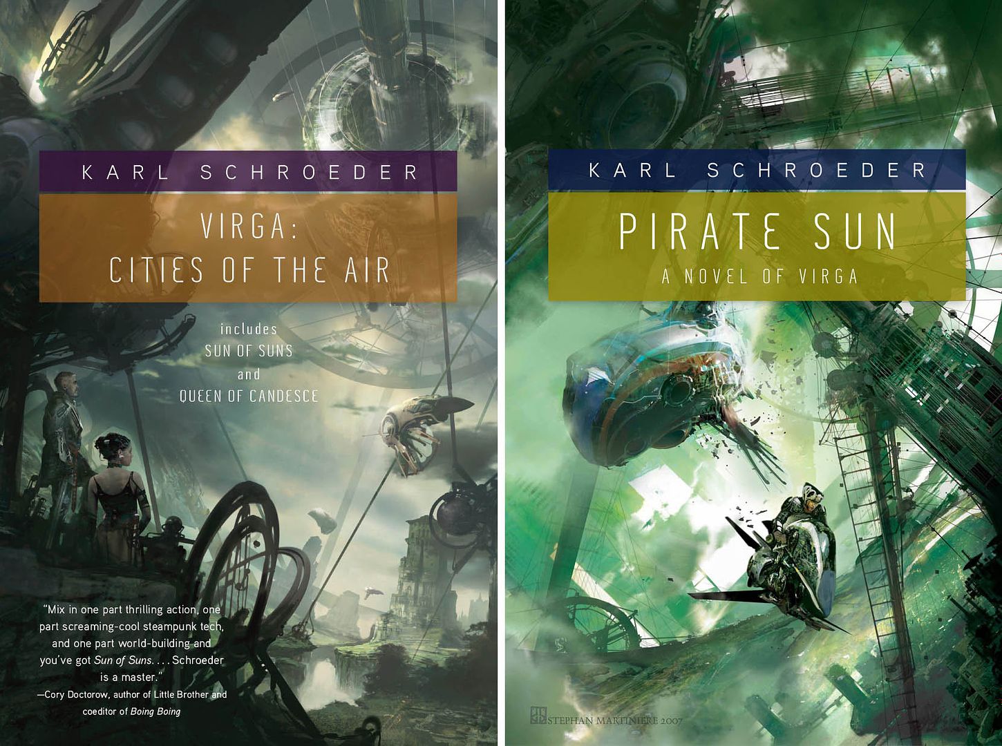
Jamie Stafford-Hill, design
Stephan Martiniere, art

It’s always fun to re-consider designs when books move from hardcover to trade paperback. Even just a few years can make you want to update a bit.

I started playing around with the color translucent panels and then, as always, meetings took over my days. Once the mechanical was labeled “Late!” I threw it off to designer Jamie Stafford-hill and said, “Kinda like this only, you know, good.” And, as always he delivered.

Cities in the Air is an omnibus of the first two novels in Karl Schroeder’s Virga series. Pirate Sun being the third volume. Two more (for now?) to come. I look forward to seeing the whole set in my favorite format.

Greg Manchess and The Irish Country...

Designer Jamie Stafford-hill had reason to email me the full gamut (so far) of our “Irish Country” It made me go “ahhhh....” The day needed a calming influence.

Layout by Jamie, art by Greg Manchess.

The covers that got away

I got batch of cover designs in today and immediately regretted that the one I liked the best, visually speaking, would never fly for the cover. In this case, with good reason — it looks freat but isn’t quite suited for the audience. Luckily, there are others in the batch that also also very good and more appropriate for the book.

Also today, I got sketches in for another book. Here we are clearly we are making the less interesting choice because it more closely resembles familiar territory. The artist is no dummy and will likely reuse the pose on someone else’s very successful book cover. (And I will be jealous!)


This happens a lot in the job. Many times I agree with the final outcome, in some cases I don’t. Below are two older examples of covers that “got away.”

The Mystery of Grace
Illustrator John Jude Palencar and designer Peter Lutjen have been the dynamic duo beyond many many Charles de Lint covers. It’s amazing how well their sensibilities work together, even more so when you consider that Charles, Peter, and John have never met.

When Mystery of Grace came up, when we knew a general outline of the story. John Jude sent in a series of sketches and I was blinded by how much I loved this puppeteer drawing. It makes for a great painting, and even a great cover, but when the author and editor brought up the fact that it was much too dark for the book, it was hard too fight it. It certainly is macabre. This is not the artist’s fault. If I had been thinking more clearly, I would have asked for other sketches. In this case we got as far as printing Advance Reading Copies with the puppet cover before we were able to about-face and start over. (I’m told you can find those advance reading copies on eBay every now and then.)

Since we do have such a long and wonderful history of Palencar covers on de Lint books, there was never a question of what to do — I went back to John, described the book more fully, and gave him a clearer understanding of how we wanted to position it. It was a whole second commission for him — a pricey mistake on my part but, thankfully, not one that I make too often. In the end, the second cover is just as lovely in a different way.


Blood Groove
In this case, it was tough to get the marketing tone right. The initial copy and the title made it sound a bit campy and hipstery. When talking to the editor, the book sounded much more gritty than that, and it sounded much more grisly than the current slew of hot Twilight-y vampires. Designer Jamie Stafford-Hill went to town on the idea of a truly horrific, old school vampire. What you can’t see here is, he even requested a slightly textured varnish to make the cover just a tiny bit pebbly your hand. We did an advance run on the jackets and they looked great. Really great. In the end, though, Sales and Marketing felt that we should try to hit larger audience an go with a “movie-poster” style cover.

Selling more books is good for everybody — everyone from the author, to the bookstore clerks, to the truck drivers moving inventory around — so it’s difficult to say that going more commercial is a bad thing...But truth be told, this was example where I wish we could have stuck with something that was a bit more unique and engaging. While I certainly like the re-do, quite a bit actually, I’ll always wonder which cover really would have performed better.

Blog Archive